Nonprofit Videos We Love: 10 Inspirational Examples
Currently, video is the marketing tool for grabbing supporters’ attention. Video marketing surveys report that 92% of businesses said they see a positive return on investment from video, 87% say it has positively impacted sales, and 96% say it has increased understanding of their products.
These numbers are hard to beat, and nonprofits can take a page from businesses finding success with video by incorporating it into their own strategy.
To help you get started, we’ll explore a few video fundamentals for nonprofits before sharing 10 videos to inspire your video-making efforts.
- Why do nonprofits need video?
- How do you make a nonprofit video?
- 10 Inspirational Nonprofit Videos and What Makes Them Great
As you envision your own videos, stay focused on how they’ll fit into your marketing plan and what you can do to get as many eyes on them as possible.

Why do nonprofits need video?
The statistics about the power of video don’t lie, but why is video such a strong medium for nonprofits? With its ability to share immersive visuals, audio, and stories, video can help your nonprofit demonstrate its:
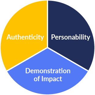
- Authenticity. Live-action visuals give audiences a look at what your nonprofit does on a day-to-day basis, making your mission feel more real than just text alone can convey.
- Personability. Putting a face to your cause allows supporters to form a deeper connection with those affected by your target issues.
- Demonstration of impact. It can be challenging to conceptualize just what your nonprofit does from stats and written descriptions. Video shows exactly what your initiatives accomplish and how supporters can help.
Need more evidence? Fortunately, marketers have already done the research to back up their confidence in using video.
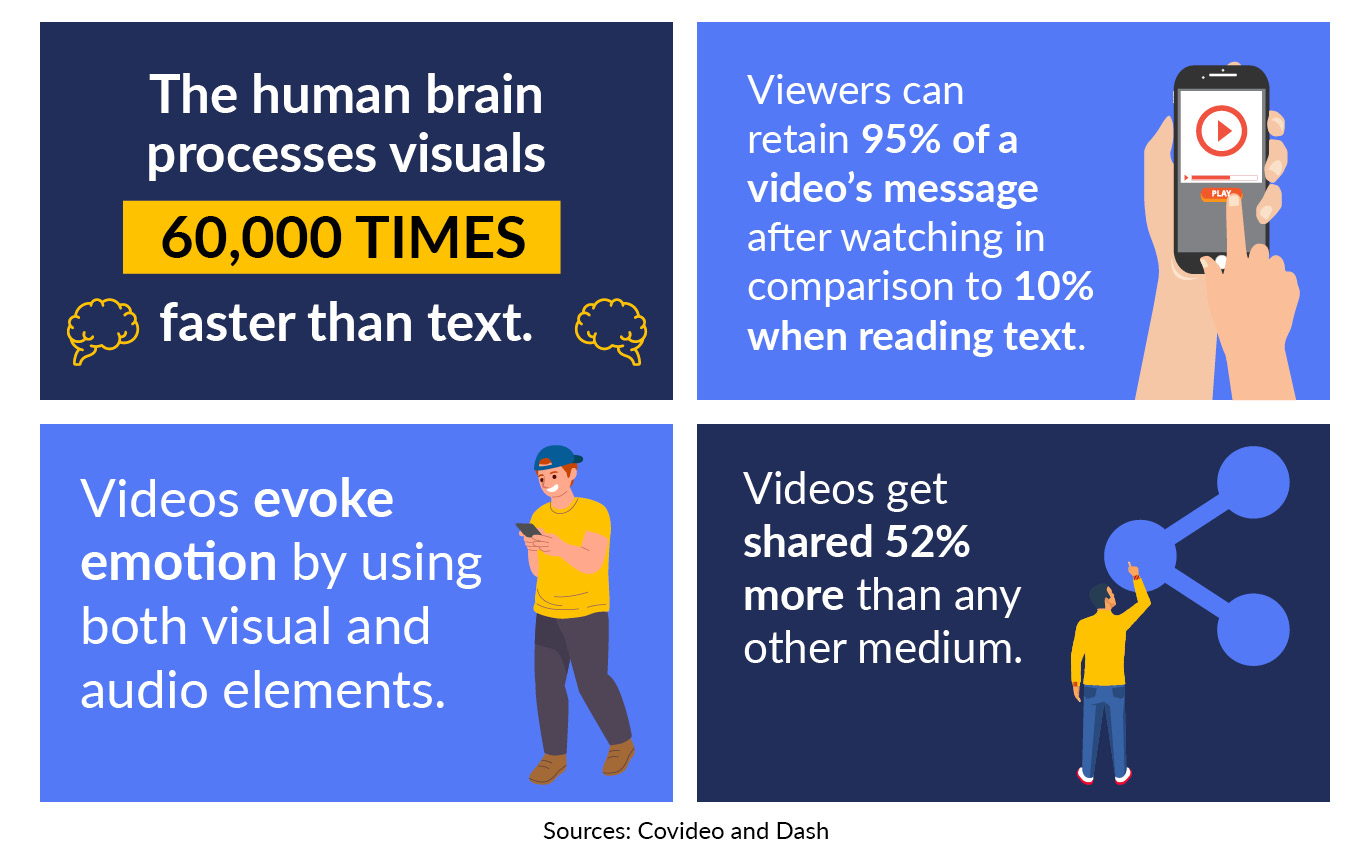
- Video content is easier to process. The human brain understands videos far more efficiently than it does text, processing visuals 60,000 times faster and retaining 95% of a video’s message as compared to just 10% when reading.
- Videos provoke emotion more easily. While written stories can be moving, video ultimately has a leg up on other mediums by invoking visual and audio cues to stir emotion. In turn, these emotions can help your nonprofit push viewers to take action.
- Videos are more shareable. Video gets shared 52% more than any other type of online content, including social media posts, blog articles, and product pages.
With these benefits, video can be a transformative new tool for grabbing supporters’ attention.
How to make a nonprofit video
Just like developing a general marketing strategy, your nonprofit videos must have a clear goal, a specific audience, and the right tools to see it through to completion. Let’s break down what these factors mean for video.
Establish Your Video’s Purpose
Nonprofit video is a broad term that can include short animated videos about a specific issue as well as over 30-minute videos announcing a new program initiative. When planning your video, decide what actions you want viewers to take afterward, whether it’s donating, volunteering, or just being more informed.
To give you an idea about what kind of video to produce, here is an overview of the main six types of nonprofit videos:
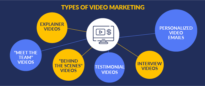
- Explainer videos. If your nonprofit wants to spread awareness or educate the public, explainer videos are the way to go. These educational videos focus on a specific topic, process, or idea, and break it down in an easy-to-understand manner.
- “Meet The Team” videos. Introduce the people behind your nonprofit with a “Meet the Team” video. These types of videos are most effective when shared with supporters who are interested in your cause and want to learn more about your organization specifically, so try adding it to your website’s about page or sharing it with your emailing list.
- “Behind The Scenes” videos. Let supporters know exactly how your nonprofit fulfills its mission by filming volunteers at work or giving a tour of one of your program’s on-site locations.
- Testimonial videos. Seeing the individuals helped by your nonprofit can help supporters feel a stronger emotional connection to your cause. Sit down with your constituents and let them tell their own stories about how your nonprofit has impacted them.
- Interview videos. If your nonprofit has connections to experts in your field, bring them in to help with an interview video. For many viewers, seeing a trusted authority advocate for your mission and explain what a donor’s support can do to help your cause is a compelling reason to take action.
- Personalized video emails. In contrast to the other types of videos, personalized videos are made specifically for just one person. Write a short script thanking donors, sponsors, or volunteers for their contributions, and get a member of your team to film multiple video thank yous back to back.
Your videos can be emailed to supporters, posted on social media, or featured on your nonprofit’s YouTube channel. You can also embed videos directly into key landing pages on your website to engage visitors and teach them about your nonprofit in a quick, dynamic way.
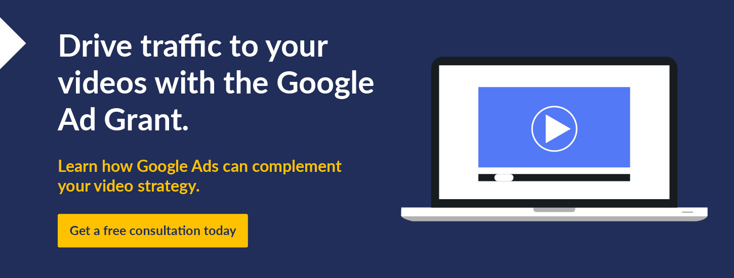
If your nonprofit is interested in the Google Ad Grant, embedding videos into your target landing pages is a way to strengthen your website as a whole, increase time on page from new leads, and start your relationship with new visitors off on the right note.

Determine Your Audience
When choosing your video type, consider who the video is for. Think about what actions you want supporters to take and what types of storytelling and visuals are likely to resonate with that audience.
While your nonprofit will be able to go into more granular detail about audience demographics when planning your videos, there are essentially three different types of audiences a video can be aimed at:
- Your current supporters. Video is an effective medium for driving calls to action, and you can create video content for specific fundraisers, advocacy campaigns, events, and other activities to share with your current supporter base.
- Potential supporters. Videos you post on social media and your website should aim to bring in new audiences. In these videos, the first few seconds are essential for grabbing viewers’ attention and sharing something memorable that will make them watch to the end and want to learn more.
- An individual supporter. Occasionally, you may want to record a video for an audience of exactly one supporter. Individual thank-you videos are an effective tool for retaining mid-tier donors who warrant more appreciation than a single thank-you email but not the individual in-person meetings of major donors.
When you know your audience, you’ll be able to choose the content, visual style, and calls to action that will inspire them specifically.
Gather Equipment or Work with a Nonprofit Video Production Company
Once you know what you want your video to accomplish and who your video is targeted at, you’ll need to consider what goes into making a video.
For nonprofits trying to stay on a budget, they can produce videos in-house. At a minimum, the equipment you’ll need includes:
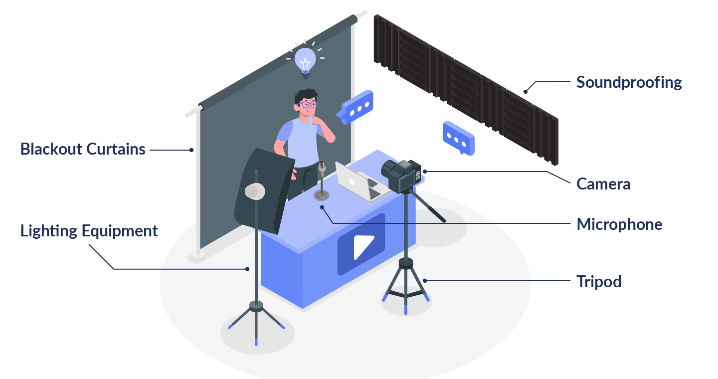
- Camera and tripod
- Microphones
- Lighting equipment
- Soundproofing
- Editing software
Additionally, consider your video style and what you’ll need to create the type of visuals you want. If you need footage of your volunteers in action, plan a day to go out and film. If you want animated footage, look up freelance animators.
For nonprofits with the resources to spend on professionally designed videos, partnering with a nonprofit video production company can be well worth the costs. Browse the video libraries of top production companies you’re considering to find one with the filmmaking style that best suits your nonprofit. Then, reach out to get more information about their process and rates.
10 Inspirational Videos and What Makes Them Great
The most surefire way to learn what makes a strong nonprofit video is to watch the inspiring videos other nonprofits are producing. To help your nonprofit start brainstorming video content, here are 10 nonprofit videos and why we think they’re great:
1. United Way of Metro Chicago
United Way of Metro Chicago’s video promoting their program to make Chicago a more equitable place for residents of all backgrounds demonstrates how nonprofits can strategically use music to evoke specific emotions in their videos.
Opening with a roaring guitar riff grabs viewers’ attention immediately before the abrupt cut to silence to highlight the impact of the interview the video is framed around, then finally transitioning to melancholy music that reflects the serious tone of the issues being addressed.
2. Love146
In their video, Family Changes the Situation, Love146 shows how nonprofits can get creative and make engaging videos even when they have little footage. With dynamic editing, the video heightens the intensity of an otherwise straightforward interview from its founder with typography, a bold visual style, and careful integration of stock footage.
3. The Colorado Trust
One effective storytelling technique is to use a specific individual’s story as a focus point for a larger issue. The Colorado Trust showcases the effects of depression in ranchers by opening with a highly personal story from one of their constituents before incorporating interviews from trained mental health professionals to put this story in a wider context.
4. American Cancer Society
Interested in creating an animated video? The American Cancer Society demonstrates how nonprofits can keep serious topics lighthearted by using a bright, cartoony style in their animated video series about how to prevent skin cancer.
5. Mutual Rescue
While many nonprofit videos are short, often under two minutes in length, Mutual Rescue’s video, Keema and Her Pack, is a useful example for organizations interested in creating long-form video content. In its nearly 10-minute run-time, the video holds viewers’ attention with multiple angles, animated visuals, and by incorporating footage and audio filmed on location and interviews shot in a studio.
6. Operation North Pole
Video can be used to promote all sorts of activities at your nonprofit as this video from Operation North Pole demonstrates. To help market a major fundraising event, Operation North Pole went all out putting together a short, snappy promotional video with fast cuts and artistically framed visuals that get event participants excited to sign up.
7. Transportation Alternatives
For some videos, just visuals and music are enough. Transportation Alternatives helps viewers visualize the importance of spatial equity through just the use of animations, typography, and music, creating a compelling video without the use of a voiceover.
8. World Vision International
World Vision International is dedicated to protecting children all over the world, and their Hidden Heroes campaign video works to show their impact over time. Nonprofits interested in creating impact videos can take cues from their use of mixed media, combining footage of volunteers at work with still photographs and historical footage.
9. Flatwater Foundation
If your nonprofit just has interviews and stock footage, you can still make a compelling video like the Flatwater Foundation. By combining multiple interviews and footage of their constituents walking through nature, their video creates a cinematic experience, pulled together by recurring images of water between cuts.
10. The Tech Interactive
With testimonial videos, many nonprofits default to filming static interviews that feature a constituent doing little besides speaking directly to the camera. The Tech Intractive aims to tell the story of one of their constituents in Scientist Stories, Robin D. López through the use of action shots that convey their organization’s impact and keep viewers engaged.
Once you make your videos, it’s time to start driving traffic to them. Discover how you can use marketing tools like the Google Ad Grant to get your video in front of supporters with these resources:
- Google Ad Grants: The Complete Guide for Nonprofits. Learn how to promote your website with the Google Ad Grant and get more eyes are your new nonprofit videos with this complete guide.
- Nonprofit Marketing: A Behind-the-Scenes Guide for Success. Where do your videos fit into your marketing plan? Ensure you have nonprofit marketing fundamentals down with this in-depth overview.
- 6 Steps to Hire an Excellent Nonprofit Marketing Consultant. Sometimes nonprofits need help getting their marketing strategy off the ground, which is where consultants come in. Learn how to find and work with a consultant who can advise your video marketing strategy.